SBC Drive-Thru
Bazaar 2022
-
Over the past few years, I have enjoyed illustrating in my designs using Adobe Illustrator. For this year’s bazaar I wanted to use illustration to create a solution that was modern, ageless, fun, and closer to my personal style.
This event is easily one of the primary fundraisers of the Sacramento Buddhist Church (SBC). Although the event has not been held in person since COVID, this year’s rendition is somewhat closer to normal. People may preorder food and merchandise and drive-thru to pick it up on a designated day at the temple.
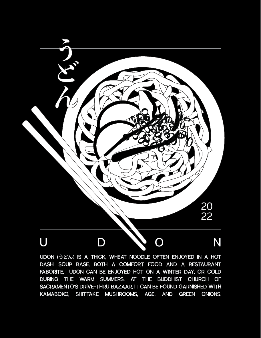
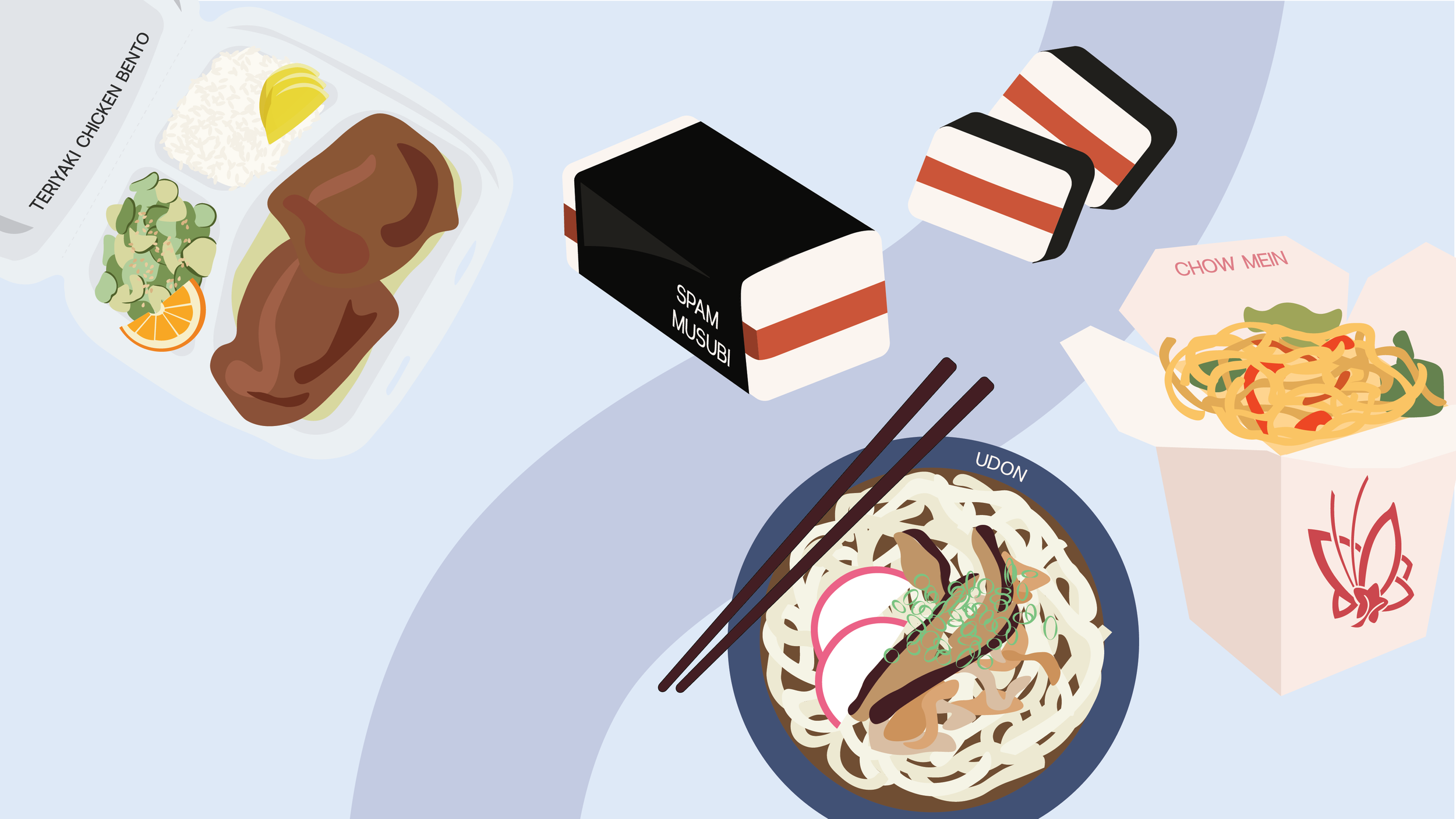
To capitalize on the event’s primary offering (the food), I decided to make this year’s poster double as a preview to what was on the menu.
-
Design system, Poster, Logo, Social Media Marketing Assets
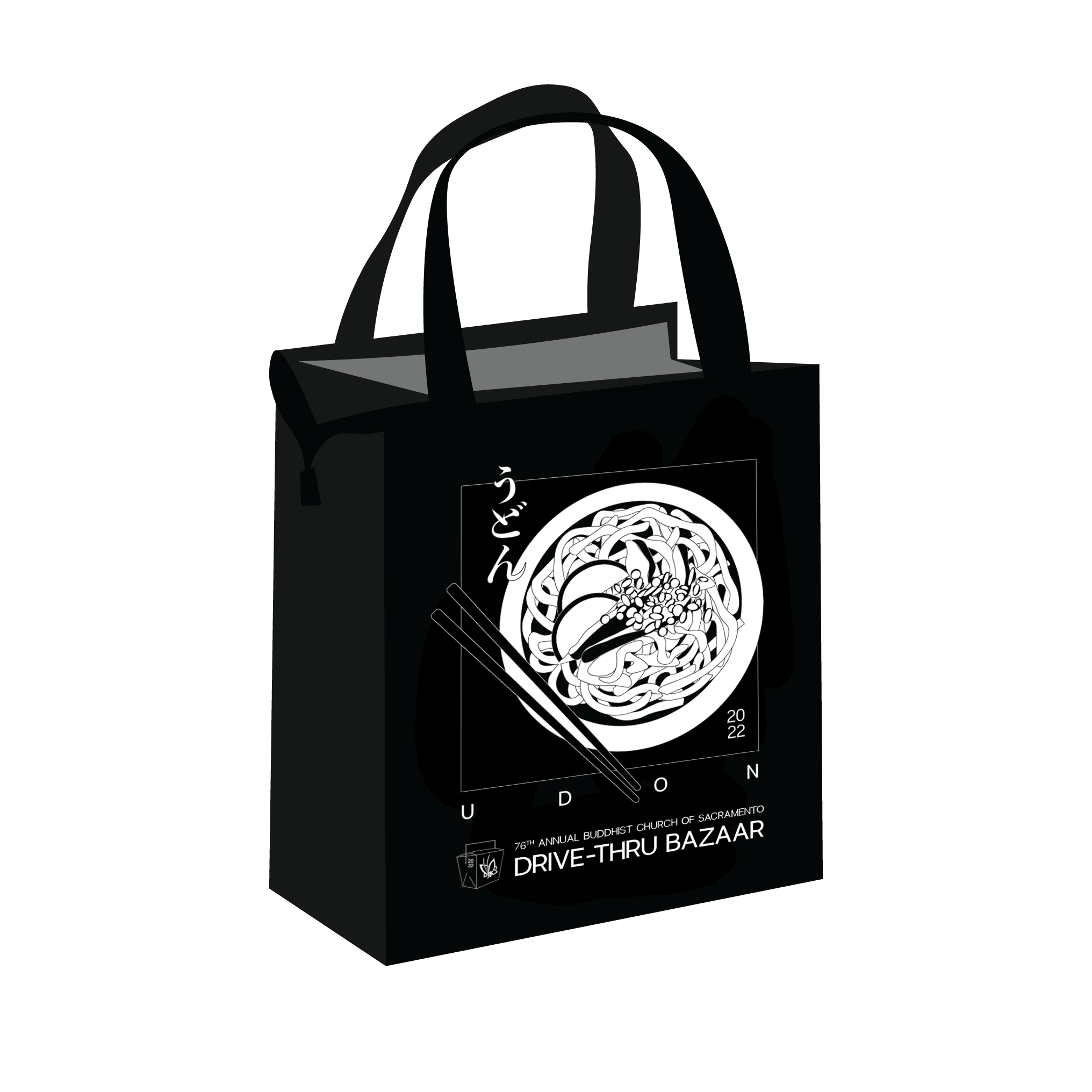
Merchandise designs: T-shirts (2), Aprons (2), Insulated Bags (2)
-
Adobe Illustrator – Illustrations, Logo, and Poster
Adobe Photoshop – Mockups and Poster
Client-facing – Presentation Design
Poster
My first designs experimented with illustration, big type for accents, and bleed-off-the-page graphics. As the team solidified the foods, their ingredients and preparation, the illustrations were updated to reflect these changes.


As much as I wanted to make the scattered letters work, the road (sans the lane markers later) worked best to subtly imply to drive-thru aspect of the bazaar’s name. Showcasing all five foods was also important to give the viewer an accurate representation of what to expect on this year’s menu. The 2022 (2nd design), also made it into the final.
The following posters were the final contenders. With the decision to add the names of the food next to the illustrations (especially for ones that were hard to depict), I developed two different styles: captions and line indicators. For the final, the team decided to go with the captions, a more integrated approach.


Logo
In between calling the event “Bazaar To-Go” and “Drive-Thru Bazaar”, I designed two different logo per the event team’s request to have a icon-based logo that was more representative of this year’s event’s unique circumstances. Personally in support of how the take-out box was connected to poster, the team also decided to move forward with this first option. Although this is the primary logo, it later had to be adapted in merchandise design to cut down color printing cost.

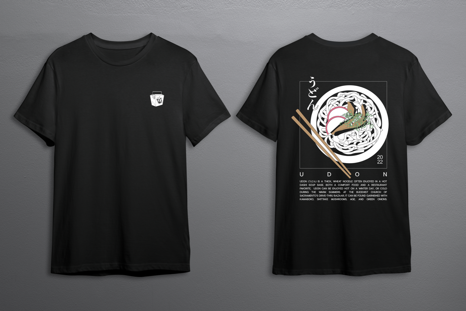
Merchandise
Many community members collect the Bazaar’s T-shirts and aprons as annual memorabilia or a way to support the fundraiser. More often than not, these items will be worn once or twice, but buried away or donated soon after.
To combat the short lifecycle of the bazaar’s merchandise, I intentionally advocated for a design that was subtle in advertising the event, simplistic, and wearable for everyday, yet still kept production costs down
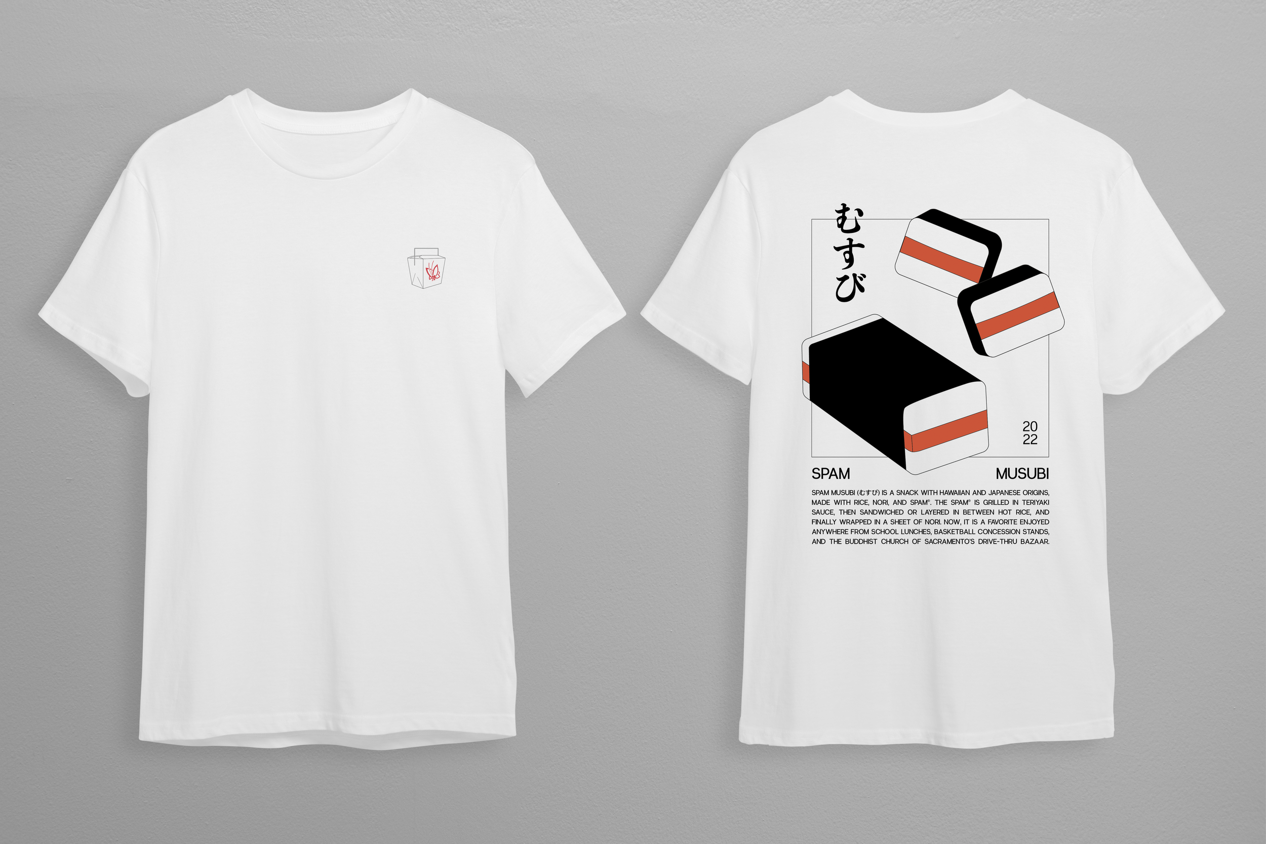
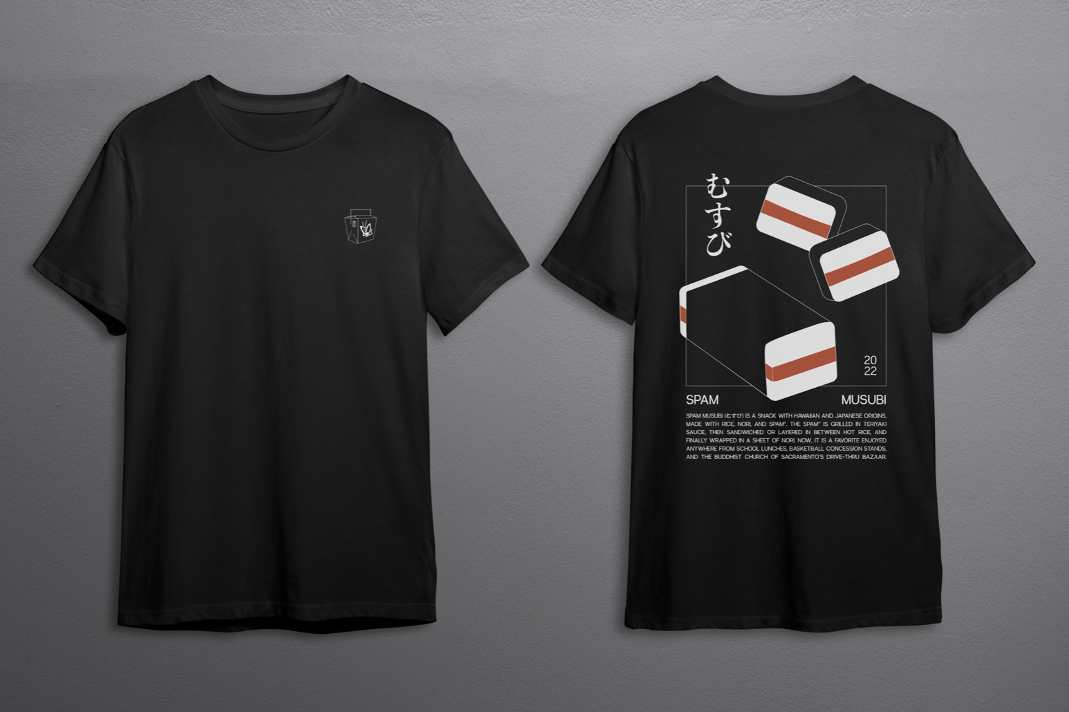
This original design was based on an early poster mockup. The outlines were used to cut down production costs through colors. The design didn’t make it, but the team suggested highlighting one or two of the foods instead, specifically the chow mien and the spam musubi. That suggestion brought me to my next idea.


While designing for the spam musubi, I decided to add a description and the hiragana to balance the negative space in the illustration and thin lines. When I moved to the chow mien, I ran into the issue of not being able to write copy as easily or including the characters. While they were both crowd favorites that frequented previous bazaar fundraisers, the chow mien was not a Japanese food like most of the others. Therefore, I explore using the udon as an option for the second design, and the team and I agreed that it fit the system better than the chow mien could.
Below in the slideshow are the final designs on black and on white, as well as mockups for the various merchandise that we be sold at the 2022 Bazaar.